

Color Theory for Logo Design: Colors, Fonts and Shapes

James Thole, contributing writer
James Thole
December 12, 2018
5
minute read
logo design
Designers in a studio discussing color theory for logo design

Color theory for logo design comes down to three jobs: pick colors that match the feeling you want, combine them so they contrast and read clearly, and keep them consistent on screens and in print. Shapes and fonts send signals too, and the best logos make all three agree. A calm color on an aggressive font, or a playful shape on a serious brand, leaves people unsure what you are.

What colors tend to signal

People react to color before they read a word. These are the common associations:

  • Blue: trust, calm and professionalism. It is common in finance, health care and professional services.
  • Red: energy, passion and urgency. It grabs attention fast.
  • Yellow and orange: optimism, warmth and friendliness.
  • Green: growth, health and nature.
  • Purple: luxury and creativity.
  • Black: sophistication, seriousness and a premium feel.

These are tendencies, not rules. Context changes the meaning. Red on a restaurant sign says appetite. Red on a bank statement says debt. Culture changes it too. In many Western markets white suggests purity, while in parts of Asia it is linked with mourning. If you serve a mixed audience, check how your colors read to the people you want to reach.

A diverse group of people discussing color choices for logo design in a sunny park.

Start with your audience, not your favorite color

Many owners pick colors they personally like. Your customers matter more. A children's toy store can use bright yellows and oranges. A law firm usually wants deep blues and grays. Younger audiences often respond to bolder colors, while older audiences may prefer softer tones. Decide what you want customers to feel, then choose colors that support it.

Look at your competitors as well. If everyone in your field uses the same blue, a different color can make you easier to remember. Just make sure it still fits the feeling you want.

Build a palette with the color wheel

The color wheel gives you a few reliable ways to combine colors:

  • Complementary colors sit opposite each other, like blue and orange. They create strong contrast and make elements stand out.
  • Analogous colors sit next to each other, like blue and green. They feel calm and harmonious.
  • Monochrome palettes use shades of one color. They look clean and are easy to keep consistent.

Keep the logo to two or three colors. More than that is hard to reproduce and harder to remember. Free tools like Adobe Color and Coolors let you try combinations before you commit.
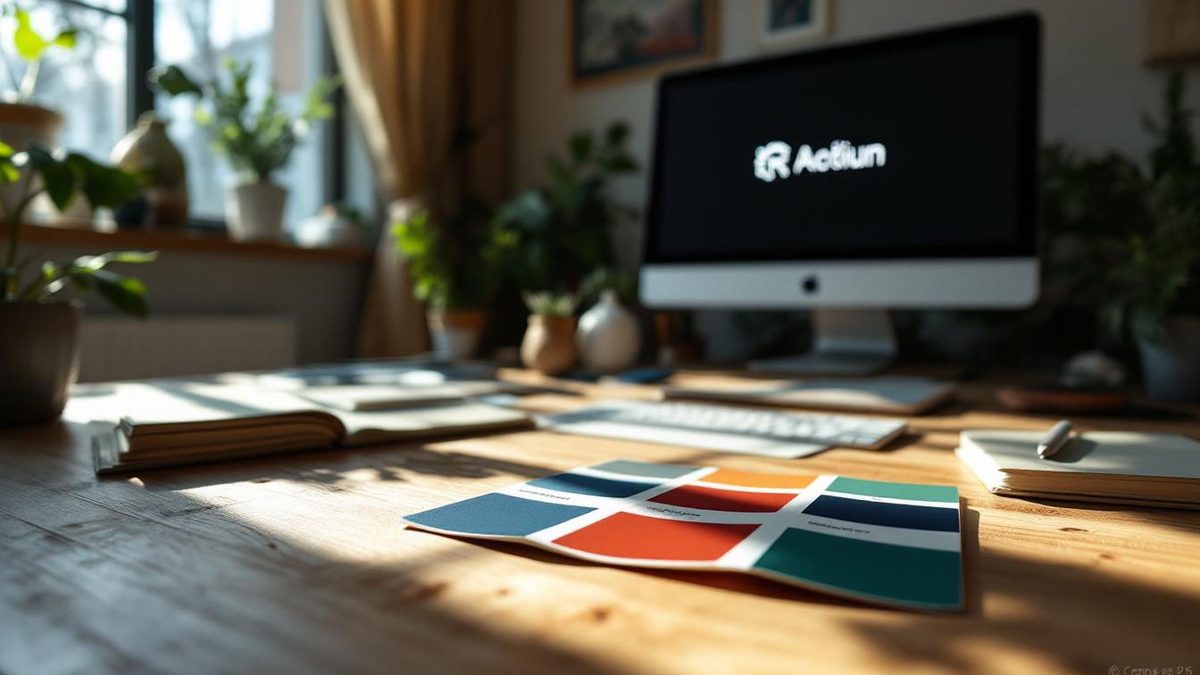
Designer workspace with timeless color palette for logo design.

Check contrast so everyone can read it

Contrast helps everyone read your logo, including people with low vision or color blindness. Light yellow on white fades away. Dark blue on black disappears. Run your color pair through a contrast checker, and make sure the logo still reads in black and white. If it only works in color, the design has a structural problem.

Keep colors right on screen and in print

Screens and printers make color differently. Screens mix light in RGB and can show bright, saturated colors. Printers mix CMYK inks, which cannot reach some of those bright tones. A vivid screen blue may print dull.

  • Record hex or RGB values for web and social use.
  • Record CMYK values, or a Pantone spot color, for print.
  • Print a test before a large run and compare it with the screen version.
  • View the logo on a few phones and monitors, since screen settings change how color looks.

Put these values in a one-page style guide so every printer and vendor uses the same ones.

Common color mistakes

  • Too many colors. It distracts, costs more to print and weakens recognition.
  • Chasing a trend. This year's popular shade can make a logo look dated fast. Classic pairs like navy and gold, black and white, or green and white hold up well.
  • Ignoring context. A color that works on your website may clash with your sign or vanish on a dark photo.
  • Letting it drift. Slightly different shades on the website, the truck and the business card make a brand feel careless.
A graphic designer's workspace illustrating common mistakes in logo color selection, with color swatches and sketches.

What shapes say

Shapes carry meaning even without words. Here are the common reads:

  • Circles and ovals: community, unity and warmth. Interlocking circles suggest partnership. Ovals feel softer and a little more in motion.
  • Squares and rectangles: stability, reliability and order. They suit law, finance and trades, where trust is the pitch. Add one unexpected detail so the mark does not feel stiff.
  • Triangles: direction and energy. Pointing up reads as growth. Pointing down can feel unstable.
  • Lines: precision and clarity. A few strong lines can suggest speed or order. Too many turn into noise.
  • Abstract shapes: uniqueness. They can become very ownable, but they need a strong brand behind them to mean anything.

Geometric shapes feel structured and precise. Organic, hand-drawn shapes feel natural and creative. Choose the one that matches how your business actually works.

Negative space is another tool. The empty space between letters or shapes can form a second image, which adds meaning without adding a single element.

Two designers reviewing simple black geometric shapes for a logo

How fonts set the tone

Type sets a tone before anyone reads the words:

  • Serif fonts feel traditional, established and trustworthy.
  • Sans serif fonts feel modern, clean and approachable.
  • Script fonts feel personal, elegant or playful, depending on the style.
  • Heavy, bold fonts suggest strength. Thin fonts suggest refinement.

A bouncy, rounded font on a law firm's logo reads like a party invitation. That gap between what you mean and what people see is where logos fall apart. A few rules keep type working:

  • Use one font, two at most.
  • Make the business name the most prominent element. Any supporting text should stay smaller and lighter.
  • Test it small. A thin or ornate font that looks elegant on a large screen can blur on a business card or a phone.
  • Check the license for any font you use in a logo.

Free libraries like Google Fonts are a good place to explore. For fonts beyond the logo, see our tips for choosing website fonts.

Make color, shape and type agree

The three choices have to tell the same story. A square in deep navy with a serif font says steady and established. A rounded shape in bright orange with a friendly sans serif says approachable and fun. Mix them carelessly and the logo argues with itself.

Before you commit, put the logo in front of a few people who fit your customer profile and ask them to describe the business in three words. If those words match your intent, the pieces agree. Our logo design tips and 9-step logo design process cover testing and the rest of the work.

Want a second opinion on your colors?

Skratch Creative offers logo design for small businesses. Call (281) 400-6893 or send us a message if you want help choosing colors, shapes and type that fit your business.

LATEST POSTS
A small business owner waiting on a phone while a slow website loads to a blank screen
web design

Core Web Vitals Explained

Mike Willett, founder of Skratch Creative in The Woodlands, Texas
Mike Willett
August 12, 2026
Brand identity materials laid out for a business branding strategy in The Woodlands

Branding Strategy for Small Businesses in The Woodlands

Mike Willett, founder of Skratch Creative in The Woodlands, Texas
Mike Willett
June 6, 2026
Small business owner seeing his business cited in an AI search answer

How to Get Your Business Cited in AI Answers

Mike Willett, founder of Skratch Creative in The Woodlands, Texas
Mike Willett
June 6, 2026
get a quote

let's talk a little.
drop us a line.

Please enter your phone
Please enter your email
You need to provide a company name
Previous
Thanks. We got your message and will reach out soon. If it is urgent, call (281) 400-6893.
Something went wrong. Please call (281) 400-6893 or email mwillett@skratchcreative.com.