
Color isn't decoration. It's one of the strongest tools we've got, and it quietly shapes how people feel, what they click, whether they trust you. Get color right and your site says something about your brand before a single word loads.

Let's dig in.
Color theory is really just how colors play off each other. We lean on the color wheel and the way certain hues make people feel, then use that to put combinations together that don't fight on the page.
Most people overthink this. Color theory just explains how colors play off each other, the wheel, the weight each hue carries. The wheel sorts colors by how they relate. Your primaries are red, blue, yellow. Mix those and you get secondaries (green, orange, purple), mix a primary with a secondary and you land on a tertiary. Simple once you see it laid out.
And the wheel isn't some art-class relic. We treat it as a working tool on every project, no exceptions. Say we're building for a coffee shop in The Woodlands. We'd reach for warm earth tones, browns and greens that feel grounded, and that's no accident, that's color theory earning its keep.
Look. Harmony just means your colors look intentional instead of fighting each other, the good schemes hold your eye without the chaos. Complementary colors sit opposite on the wheel and crank up contrast, analogous colors sit side by side and feel calm. Triadic colors space evenly around the wheel, and honestly they give you vibrance without losing the balance. Each one does a different job. And I've watched the wrong pick quietly wreck everything else on a page. Sound familiar?
Take a Houston tech startup chasing high energy. A triadic scheme with orange, green, and purple gives them exactly that, and it tells you something about the company before you read a line.
Colors pull at emotions and shape how people read a brand, which directly affects their experience on the site. A red doesn't say the same thing a soft blue does.
Every color carries weight. Red creates urgency, which is why it shows up on clearance tags and call-to-action buttons (CXL). Blue reads steady, so financial sites lean on it hard. Green signals growth and calm, a natural fit for health brands. Yellow grabs attention fast. But push it too far and people feel worn out within seconds.
Here's a real one. A wellness site we built in Spring runs green as its dominant color, and that one decision reinforces the whole nature-and-relaxation message before anyone reads a headline. The color does conversion work, quietly, on every page. Not complicated. Just consistent.
Once you know these effects, you pick colors that match what your brand wants to say. And culture matters here too. White reads clean and pure in Western markets, in some Eastern cultures it signals mourning. Get that wrong on a global site and it isn't just a design slip, it's a trust problem.
A global store serving users across regions might land on a neutral palette of blues and grays. Keeps the look professional, and it sidesteps color associations that swing wildly from one culture to the next. Sometimes restraint is the right call.
Honestly, color theory comes down to picking a palette, checking the contrast so people can actually read the thing, and keeping it consistent everywhere. Nail those and you've handled user experience and brand identity in one move.
We start with a palette that fits your brand, and it has to speak to the people you're after. A good palette pulls double duty. It makes your site look sharp, and it makes the site work better, because colors carry emotional weight. None of those choices are random.
Here's a real one. A boutique fashion retailer in Conroe might build around black, white, and gold to signal luxury. That palette looks expensive, sure. But it also tells a certain shopper they landed in the right place. The colors do the positioning before anyone reads a single word.
Contrast between text and background isn't optional, and users with visual impairments lean on it to read comfortably. Contrast checkers make it easy to test combos before anything goes live. Skip that step and you've locked out a chunk of your audience. Sound familiar?
Picture a local news site pushing a hundred articles a week. Black text on white isn't exciting, but it reads for everyone, including folks with low vision, and that kind of attention to the basics keeps people on the page long enough to actually read what you wrote.
Consistency builds recognition. We tell clients to run their palette across buttons, headings, backgrounds, every element a user touches. When it all matches, the brand sticks. When it doesn't, people notice. Even if they can't say why.
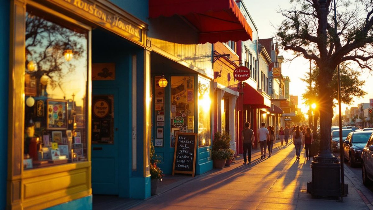
A restaurant chain with spots across Houston and the suburbs makes a good test case. When the website matches the physical locations, customers get something they recognize whether they're booking a table online or walking through the door. And that recognition turns into trust over time.
Here's the thing nobody says out loud. Most designers treat accessibility like a checkbox, but honestly it's a design call that hits a real slice of your audience. High contrast between text and background helps users with color vision deficiencies read your content without fighting the screen, and most people underestimate how many folks this touches (Colour Blind Awareness).

That's the whole game.
The Web Content Accessibility Guidelines hand you hard targets, at least 4.5:1 contrast for normal text and 3:1 for large text (W3C / WAI). But contrast isn't your only lever. Color alone can't carry the meaning. Say a chart uses a red line and a blue line, you add labels or patterns too, because someone who can't tell those colors apart shouldn't have to guess what the data says.
And alt text? It gets treated as an afterthought way too often, and it really shouldn't. A screen reader user reading a travel blog about The Woodlands leans on descriptive alt text to know what a sunset photo actually shows. Write good descriptions and everyone enjoys the content, not just the people who can see it.
Look at what actually worked first. These examples show how smart color choices sharpen engagement and pin down a brand, and we'd study a few before locking in your own.
Spotify runs a dark theme with that green accent humming against it. The color earns its spot. Contrast sits high enough that nobody squints, and the green pops against all that dark in a way that feels energetic without going chaotic. That combo nails the exact mood you get the second you open the app.
A client of ours went the opposite direction. Blue and white, clean, minimal. And it works just as well, that palette reads reliable before you touch a single feature, and since the scheme stays simple the interface never piles up on you. Two opposite strategies, both on purpose.
Look, most people start with whatever looks pretty to them. Wrong move. We tell clients to start with the brand and the audience first, so if you're serving Houston-area businesses, think hard about what reads as trustworthy in that market. Then you pick one dominant color, one accent, one neutral. Three colors carry a whole site.
Run a WCAG contrast checker. Plenty of free ones live online, you want at least 4.5:1 for body text and 3:1 for the bigger headings. And run every text-background pairing through it, not just your main content. People skip buttons, navigation, footer text all the time (those matter just as much, honestly).
No. Color on its own fails users with color vision deficiencies, which hits roughly 8% of men, so you add labels or patterns alongside the color and the information reads no matter how someone sees it. And this isn't only an accessibility thing, it makes your data clearer for everyone who looks at it.
Simple. Specific. Honest.
We tell clients to audit anytime they change brand colors, redesign a section, or add new content types. For most sites we work with in The Woodlands and the surrounding areas, a full audit every 6 to 12 months catches drift before it becomes a real problem. Don't wait for a complaint to find out something's broken.
Yes, a lot. Consistent color can lift brand recognition by up to 80%. When your Spring or Conroe business runs the same palette across the website, the social feeds, and the physical space, customers build that mental link faster, inconsistency creates friction and users feel it even when they can't tell you why something seems off. Sound familiar?
Working through color decisions for a new site or a redesign, want a second set of eyes? Reach out to us. We've helped businesses across The Woodlands, Houston, and Conroe build sites that look intentional because they actually are.
Good color choices start with knowing your brand values and what your users expect the second they hit the page. We pull from examples that already work, dig into why they worked, then apply that to whatever project is in front of us. Color isn't decoration. It shapes how people feel about your brand before they read a single word.
A local bakery here in The Woodlands rebuilt its whole site around soft pastels, trying to match how fresh their stuff actually tastes. That one choice pulled in more visitors and pushed online orders up. Why? The visuals matched what people already picture when they think bakery. Cohesive beats clever, every time.
A few traps catch everyone: too many colors, weak contrast, ignoring what colors mean in different cultures. All of it confuses people and waters down what your brand is trying to say.
Too many colors. That's the wreck we see most. It overwhelms people fast, the whole site feels like nobody planned it, visitors bail before they figure out where to look. We keep palettes tight, that gives your eyes somewhere to rest instead of bouncing between fifteen tones all fighting each other.
Skip the contrast and you kill readability, low contrast also fails accessibility standards. We check the ratio between text and background, we fix whatever falls short, then we run it through real tools instead of squinting at the screen. This one isn't optional if you want everyone reading your site.
Color means different things in different places, and brands land in real trouble overseas when they forget that. Red means luck somewhere. Danger somewhere else. We tell clients to research what their colors signal in the audience's region before they lock anything down, because get this wrong and you don't just look off, you lose trust, you bleed people quietly.
Picture an online marketplace selling to Western and Asian customers at once. Skip the cultural homework and they're shoving a big chunk of their audience out the door, and honestly, that one's avoidable.
Worth saying plainly.
We reach for Adobe Color, Coolors, and a good contrast checker. They help you land a palette that hangs together and confirm it's actually accessible.
Adobe Color is where a lot of us start. You build schemes across different modes, analogous and monochromatic and triadic, you test combos before committing to anything real. It's free, it's fast, and it shows you relationships between colors you'd never catch staring at hex codes.
Coolors spits out palettes quick, it lets you lock the ones you like while it shuffles the rest. But the feature worth knowing? The color blindness simulation. It shows how your palette reads to people with different kinds of color vision, so you're designing for everyone instead of just the average eye.
Here's the thing nobody says out loud about contrast checkers. They do one thing and do it well. They calculate the ratio between your text and background, then tell you straight whether it clears accessibility standards. We use them every time we finalize a palette. A small business owner in Conroe running their own site wants these tools before launch, not after a customer calls to say they can't read the menu. Sound familiar?
Pair these two and you stop guessing. You test. And tested color choices reach more people, they hold up better across screens too.
Where things are heading: thoughtful color schemes, dark mode, and palettes that adjust to the person looking at them. It's all about keeping people engaged and happy.
Adaptive color schemes are catching on fast. These palettes shift with the time of day or with how people poke around, so a site feels alive instead of frozen stiff. Done right, they feel personal, and the user never lifts a finger to get there.
Dark mode stopped being a trend a while back. It eases eye strain on the long sessions, it saves battery on mobile, and honestly? Most people just expect the option now. Designing for both light and dark without wrecking your brand identity is a real technical headache. We solve it anyway, and users notice when you've thought it through.
Personalized color goes further. Hand users control over a site's scheme and engagement climbs, people stick around longer, the thing feels built for them. We watched this play out on an educational platform serving a global audience (they let users pick their own scheme), and retention climbed because the experience felt tailored to each person. That's the shift right now, away from one-size-fits-all and toward choices that actually stick.
Brand colors carry real weight in how people recognize you, how they come to trust you. We tell clients to run them consistently everywhere, the website, the social profiles, because that consistency builds recognition and recognition builds trust. Skip it, though, and every new visitor starts from zero.

This part trips people up.
Picture a Houston restaurant running its signature red and gold across the website, the menus, the signage. Every time a customer sees those colors the association gets a little stronger. That's no accident, it's deliberate, and it works.
Look, when we build a site in Webflow we bake brand colors into the foundation first. The logo, the nav bar, those call-to-action buttons. Those colors have to contrast well with whatever surrounds them or readability tanks. Pretty simple rule, honestly, and a lot of sites still blow it.
Or picture an online store using its brand colors for product highlights and promo banners. Those colors aren't decoration. They pull attention toward the stuff that matters and reinforce the visual identity at the same time.
Color is one of the most direct tools you've got for shaping what people do on your site. A bright red button on a neutral background grabs the eye, it tells the user this is the action. Maybe that's signing up for a newsletter, maybe booking a call. The color directs before the copy even gets a chance to speak.
Navigation works the same way. Apply a consistent color scheme to your menus and links and people learn fast what's clickable, that clarity cuts friction, and when friction drops conversions climb. We've watched it happen across 3 of our last 4 redesigns for clients in The Woodlands and Spring.
Take a non-profit built around donations. A contrasting color on the donate button, held steady through the whole site, makes that button impossible to miss. The entire goal of the organization lives right there in one color choice. Strategic, not decorative.
On mobile it's about readability above everything. Keep it accessible and visually clear, because small screens punish anything fussy.
Mobile traffic isn't coming. It's here. Your color scheme has to work on a 390-pixel screen as well as it does on a 1440-pixel monitor, and that means readable text, elements people can actually tell apart, a design that survives when somebody pulls up your site from a parking lot in Conroe under full Texas sun. Sound familiar?
We start with high-contrast combos every single time. Dark text on a light background beats anything low-contrast when somebody's squinting at their phone in bright glare. But contrast isn't only a text thing. Every button, every link reads clearly against whatever sits behind it, or it just doesn't work.
Then there's touch, which adds a whole other layer. We make buttons big enough to actually tap, and color picks up part of the job a mouse hover does on desktop. A color shift on tap tells people something happened. Without it? They tap twice, decide your site's broken, they're gone. We design around that in every Webflow build we ship.
Bake mobile color in from the start and the whole site holds together.
Accessibility climbs, smaller screens perform better, and you're not scrambling to patch things six weeks after launch.
Color hits people emotionally, and when you use it on purpose it builds a real connection between your brand and whoever's visiting.
Look, colors don't just look a certain way. They feel a certain way. Warm reds and oranges create urgency, which is exactly why you see them plastered all over sale pages and limited-time offers. No accident. It's psychology dressed up as design, and when it lands right, people respond without knowing why.
That pull builds loyalty over time (assuming it actually matches your brand voice and your offer), users start tying those feelings to you specifically. The long game. Worth playing.
Blues and greens do the opposite. They read calm and steady, which is why finance and healthcare lean on them so hard. When reliability is your whole pitch, the palette says it before the copy gets a chance to.
Picture a spa here in The Woodlands running soft blues and greens across their site. That's not accidental. It matches what the brand promises, and it shapes how you feel the second the page loads. The color does work the headline can't.
Color sets the tone and quietly walks people through the story on your site. It's one of the most underrated storytelling tools you've got, and one of the most effective.

Here's the thing nobody says out loud. Stories pull people in, and color shapes how that story feels before anyone reads a single word. Set the wrong tone with your palette, the rest of the page fights uphill the whole way. Get it right? The mood lands instantly, the visitor relaxes, your brand starts to stick.
A travel blog chasing that warm, chaotic energy of a tropical trip leans on saturated oranges and yellows. A historical archive going for nostalgia goes muted instead, ochres and dusty greens. Neither one is random. Both carry narrative weight.
Pick colors that fit your story and you build something people feel without noticing it, they explore longer, they connect more, they come back. And honestly, most sites skip this part. They grab colors they like instead of colors that work, and it shows.
We go deeper on best fonts for web design in Best Fonts for Web Design and How to Use Them.
Color theory hands you a framework for pairing colors that actually look right next to each other. We use it to pick a palette that fits the brand and matches what people already expect, so your site reads as trustworthy before anyone scans a single word.
Colors stir up emotion and shape how people see things. That changes how they move through a site and how they read what the brand is saying.
Blue reads as trust. Red reads as urgency. Neither reaction is conscious, they fire off in under a second, and most people never clock it happening. Once you know what a color signals (and honestly, most folks don't), you build the exact experience you're after instead of tripping into one by accident.
The usual suspects: too many colors, weak contrast, ignoring cultural meaning. Each one confuses people and dilutes the message.
Look, too many colors turn a page into noise. Bad contrast tanks readability fast, and ignoring cultural context means a color that reads as trust here in Houston might say something totally different somewhere else. So we keep the palette tight. We check contrast, we think past our own frame of reference, and we do it on every single build.
Go high contrast, never let color be the only thing carrying information, and add alt text to your images.
We run every color through a contrast checker. And we follow WCAG, too, on every build.
Color never carries critical info by itself on our sites. Some of your users just can't see it the way you do, and that's the baseline for a site that works for everyone who lands on it. Not a nice-to-have.
We use Adobe Color, Coolors, and a contrast checker. They help you build palettes that work together while keeping everything accessible.
Adobe Color and Coolors both spin up palettes and let you stress-test combinations fast. Contrast checkers catch ratio problems before anything ships. And some tools simulate color blindness, so you actually see what a chunk of your audience sees. We pull these in early, never as an afterthought.
Sixty-two reviews, every one of them 5.0 stars. That tells us we know what we're doing here in The Woodlands, and we've driven more than $50M in revenue for our clients, which honestly speaks louder than any pitch we could write. Want a strategy built around what's actually worked for us? Let's make something good together. Reach out to our experts.
LATEST POSTS


